Wednesday, December 27, 2017

December Kraft Plus Challenge

Ponytails and Paper Fails, December Kraft Plus Challenge


Kraft Plus Challenge December Mood Board
Kraft Plus Challenge, December Mood Board

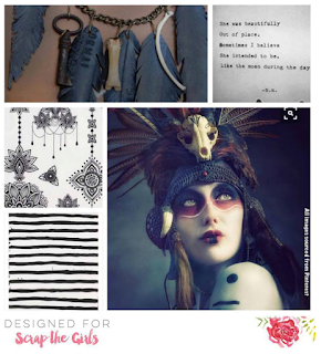
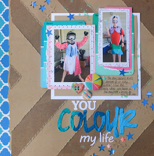
Yay I got one more page done before the end of 2017! This has been a productive year for scrapping for me and I look forward to more in 2018! I loved this month's mood board challenge.  I was immediately drawn to the teal, coral pink and yellow in the main picture. I also drew inspiration from all the lines.  For some reason I wanted to try out colour pencil on Kraft.  Of course, the final product is nothing close to what I had in my head, but I think it turned out OK.  Happy new year xx

Sunday, August 20, 2017

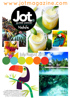
July/August Jot Mood Board

July-August Jot Mood Board Entry - Ponytails and Paper Fails


http://jotmagazine.com/julyaugust-mood-board/
 
Bula! I really wanted to experiment with texture paste over watercolours with this one.  It simply didn't work out how I'd hoped, but it has inspired me to do some pocket page spreads of my honeymoon, where my hubby surprised me by taking me to Fiji, after a few days in Sydney.  It was so lovely, and it was such a beautiful place, we would go back in a heartbeat!

Wednesday, August 16, 2017

Sunday, August 13, 2017

August Kraft Plus Challenge

bamboo + almond trees Ponytails and Paper Fails
bamboo + almond trees

http://kraftpluschallenges.blogspot.com.au/2017/07/august-challenge-leaves-and-branches.html

Once again Kraft Plus has taken me out of my comfort zone (though I must admit I do like playing with my watercolours). The August challenge is to use trees somehow on your page.  As I don't have a photo linked with this particular memory I decided to challenge myself not to use a photo on this page.  In hindsight I should have added white paint to my texture paste, but otherwise I'm pretty happy with the finished page.  Bring on spring!

Saturday, August 5, 2017

Laugh Often

Laugh Often

This layout was a labour of love. First I cut the stencil using my Silhouette Cameo out of very heavy cardstock. Then I used that to stencil my background using texture paste coloured with a little pink/peach paint.  I then created the glassine pocket for my stencilling.  The layout was built around the mint coloured paper and that fabric flower.  It look longer to make than I'd hoped but I just love the texture of that background. And don't forget, laugh often, live well and love much :)


Wednesday, July 26, 2017

Adorable


This page came together from a number of inspirations.  Firstly, it was Irit Landgraf's The Cut Shoppe's page from last month.  Please click here to see the original.  I just love her work. I chose to use some paper from the latest kit from The Scrappery Kit Club (Blair).  The July Kraft Plus challenge led to the rose texture paste background.  Lastly I took Inkie Quill's challenge to see if I could use frames on a page.  But my favourite part I think is the cute giraffe, giving it a touch of whimsy and that 'baby' feel :)


Saturday, July 8, 2017

Guest Design Spot - July Kraft Plus Challenge - Roses in 3 Ways


I was super excited to be a Guest Designer for Kraft Plus Challenge this month, where we had to use roses on a layout in three different ways.  I had this gorgeous fabric sitting around (for another project that has never happened) and I knew I wanted to use that on the layout. I also wanted to make roses a feature in the kraft background.  My first attempt using the Silhouette Cameo didn't quite work, but I tried again with a different rose, added some leaves, flipped and resized them, and I was much happier with the result.  Finally I put some of these gorgeous Maggie Holmes puffy stickers on.  The photo frame is also embossed with a rose image, however this is a little hard to see. Check it out if you haven't already, there are some amazing design team layouts to get you inspired and scrapping!

http://kraftpluschallenges.blogspot.com.au/2017/07/july-challenge-roses-3-ways.html


July Scrap The Girls Challenge Entry


http://scrap-the-girls.blogspot.com.au/
For this super simple page I wanted to make a feature of the typewriter font.  This is hard to do without a 12" typewriter or 12" printer, so I ended up free drawing a circle in the Silhouette Cameo software to cut out, then printed my journaling out in landscape mode to go behind that.  Mental as Anything came on the radio when I was doing this page, that was a bit lucky :) So glad these photos are scrapped, they have been in my "to scrap" pile for some years!

Wednesday, July 5, 2017

How to print a photo onto your background

Today's post is a little different, and written especially for Melinda who wanted to know how I printed this photo onto the background of my paper.  See May Kraft Plus Challenge Post.


Disclaimer: I am not a photo editing expert, though I have used Photoshop Elements for years and find it does what I need it to do.  Also, this photo was not printed onto a 12 x 12 inch sheet, but rather a 21 cm x 12 inch sheet which I then made up into a 12 x 12 layout.  If you want to print onto something smaller or larger, adjust your page size. Also, I use a PC. If you use a Mac, the instructions will need to be modified.  This is also my first tutorial, so please bear with me ;)

Photo Credit: Smarty Pants Photography (the real expert)

Ok, with that out of the way, this is how I did it:

I opened my photo in Photoshop Elements v 13.
By choosing Enhance > Convert to Black & White, I converted my photo to black and white (this step is optional).


I then cropped my photo.


I then proceeded to remove my background (again, optional). I did this using the Eraser tool, but you could try the Magic Wand Tool if you wanted.  After choosing the Eraser, I made the size bigger to get rid of most of it, then smaller to go around the edges.


On the right hand side, create a Hue/Saturation adjustment layer.


Up the lightness to the desired setting, to go for a more 'watermark' look.
 
 
I then flatten the image to make it easier to copy onto the page I'm gong to print.
 
 
Create a new file, by going File > New > Blank File.  Choose the settings that you need for your print size.  I chose A4.
 

Once that's created, click on Photo Bin then double click on your photo to bring it up.


Select the image by pressing CTRL + A on your keyboard, then copy it by pressing CTRL + C. 

 
Click on Photo Bin, then double click on the new file that you created.  You should now be looking at the blank file.
 
 
Place the photo into the blank file by pressing CTRL + V on your keyboard.
 
 
You can now select the Move Tool and resize/move your photo to the desired position and size.


You are now ready to print.  I always try to print on a scrap piece of paper before I print on cardstock to get a feel for how it's going to look.  If it comes out too dark, create a new Hue/Saturation layer and up the lightness, then try again. Don't forget to save your file if you think you may want it later.

Once you're ready to print on cardstock, place it into your printer and print.  I printed on a piece of cardstock 21cm x 12 inches.  This means there was a small space at the bottom of the photo that was blank, but it worked out ok for my layout.  Keep this in mind if you are printing an A4 size photo onto a larger piece of cardstock.

Hope that explains it well enough for you, but feel free to ask any questions!

Happy scrapping
Rachel xx


Monday, June 26, 2017

June Scrap The Girls Challenge


Scrap The Girls

I used the Silhouette Cameo to cut the circle shape and backed it with some Maggie Holmes papers.  Thanks to Smarty Pants Photography for the gorgeous photo of my girls.

June Jot Mood Board Challenge


June Jot Mood Board Challenge


Jot June Mood Board
Thanks to Jot for another gorgeous mood board.  It gave me an opportunity to use up a butterfly I've been holding onto for a few years now! I also learnt that I need to use my rub ons as soon as possible as they definitely have a shelf life!


Saturday, June 17, 2017

June Kraft Plus Challenge Entry

June Kraft Plus Challenge Entry
 
Kraft Plus Challenge June
 
Thanks to Kraft Plus for providing another great challenge! For some reason I decided purple would be my colour, it is probably my least scrapped colour, next to orange.  The result was a very busy page not in my usual style, but I'm glad I scrapped this family photo.  Family photos are very rare in my house. The Kraft paper I used was some old Tim Holtz paper with a resist on it.